
- A look back at pokerfuse.com’s redesigns over its two year existance.
Over the weekend we released a redesigned homepage on pokerfuse.com, with the goal of better separating our regular pokerfuse.com content with new content on pokerfuse PRO. We thought it would be fun to take the opportunity to look at how pokerfuse has evolved over the last two years.
Unfortunately, no screenshots or web caches exist for pokerfuse.com in its first incarnation. We began development on pokerfuse in January 2011 but we were not quite ready to launch on April 15, 2011, when Black Friday happened.
But we wanted to get something online fast—so we threw up a very basic single page website. It wasn’t pretty. Perhaps it’s best there’s no screenshots of version 0.1!
Thankfully, that design didn’t last long. That day we got working on finishing off our development of the real pokerfuse.com website, with a proper content management system. Below is a first draft, which we had working internally by late April.

By the time this went live, it looked more like following; this is an internal screenshot (note the test titles), but this, we believe, accurately represents the first “real” pokerfuse.com homepage:

And this is what a news article page looked like:

Although today’s pokerfuse has little in common with that design of two years ago, you can still spot many things that have lasted until today: The share buttons in the top right; the “search the news” just below; news category names; the large gray box at the top on the homepage. We even had our handy “pokerfu.se” domain shortener up and running by then.
This iteration lasted about ten weeks. We knew what we had was still just a placeholder; and we needed to call in the help of a professional designer to create a logo and give us a clear design consistency throughout the site.
We’re not clear on the exact date that version 2 went live, but it was definitely by the end of July, which is when archive.org took its first snapshot.

You can see a lot of the design decisions then are still present today. But that didn’t mean we stopped tinkering. February 2012 saw “version 3” of the homepage go live: we removed the “carousel” image scroller and implemented a much simpler column approach. We also added our popular podcast directory around this time:

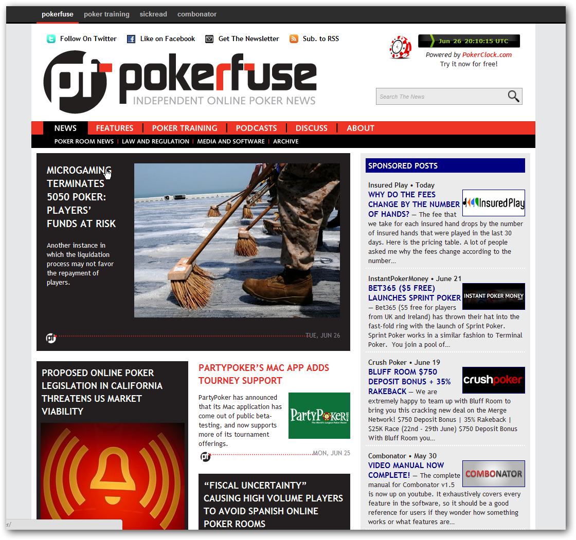
In mid-May 2012, the Sponsored Posts bar was introduced on the right hand side, the “fusebar” running along the top to interlink our various websites was added, and other bits and bobs were tidied up. We’re also now sporting the Poker Training Video directory, and Poker Clock is now rocking it in the top right with a real clock.
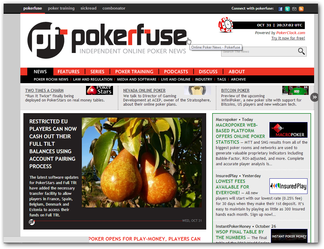
The last major change we did was in October 2012. We simplified things a lot with removing the two-column approach, we introduced “spotlights,” our name for the featured stories in carousel running along the top, and sponsored posts were changed to the fetching green. “Connect with pokerfuse” was moved into the fusebar.
So there we have it! Eight designs in two years with the new one today—but one you can’t see.