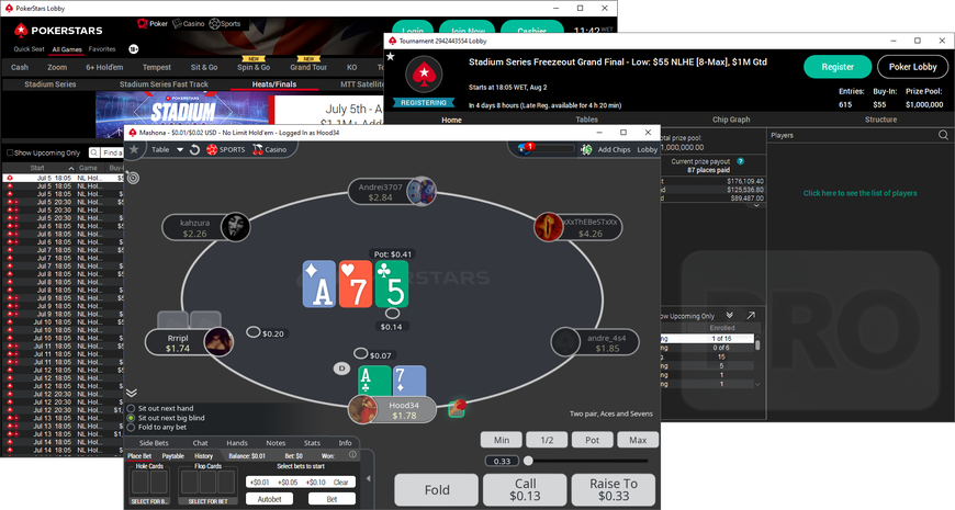

- New Carbon design introduces a “single chip” concept and a timer integrated into the player plaque.
- It also adds a new minimalist deck that innovates with a different hole card and board design.
- Dark mode now expands to tournament lobbies.
PokerStars has rolled out a significant update to its desktop software that introduces a new minimalist table theme and deck, dubbed Carbon, improves the dark lobby theme, and adds more “throwables” virtual objects.
Carbon is currently available in beta and the operator is soliciting feedback. It was first made available for cash games only, though at the time of writing Carbon was also available for some tournaments too. It is not yet available on Zoom.
First spotted in the free-play dot-net client earlier this week, it has since rolled out globally. Today it is available in various markets, including Spain, the UK and the international “dot-com” market.
The operator has also improved the integration of the dark theme across parts of the lobby. This first deployed two months ago and switched the main lobby sections—the quick seat tabs and the table lists for cash games and tournaments—over to a darker aesthetic.
This has now expanded to tournament lobbies, so these pop-out windows are also now set against a dark background. Other sections—like My Stars, settings and tools—are still white, but are expected to get the dark paint brush in the future.


