
PokerStars has deployed a new software upgrade, improving various aspects of the playing experience, especially for tournament players.
Gone are the days of software updates shrouded in secrecy. PokerStars now regularly shares detailed release notes for its monthly software upgrades, ensuring players are well-informed about the changes coming their way.
On Monday, October 16, PokerStars introduced its most recent software update, with the spotlight on the revamped tournament lobby, providing players with a more user-friendly and visually appealing experience.
- Deposit $10 or more and get a 100% bonus match up to $600
- One of the best mobile apps
- Biggest MTT guarantees
Notable Changes in the Tournament Lobby
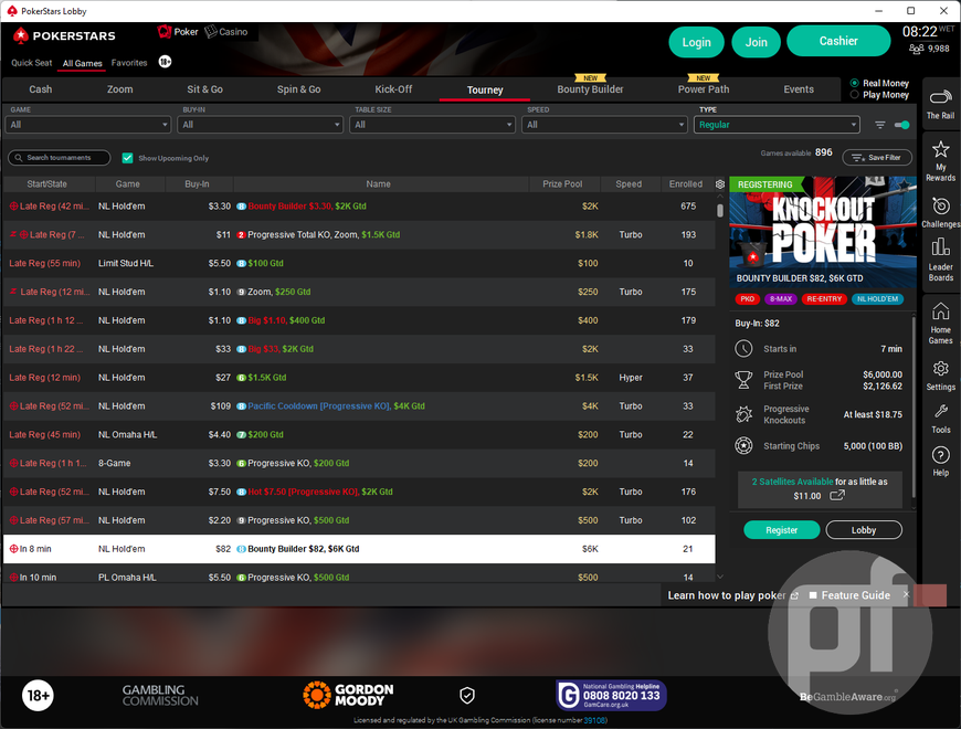
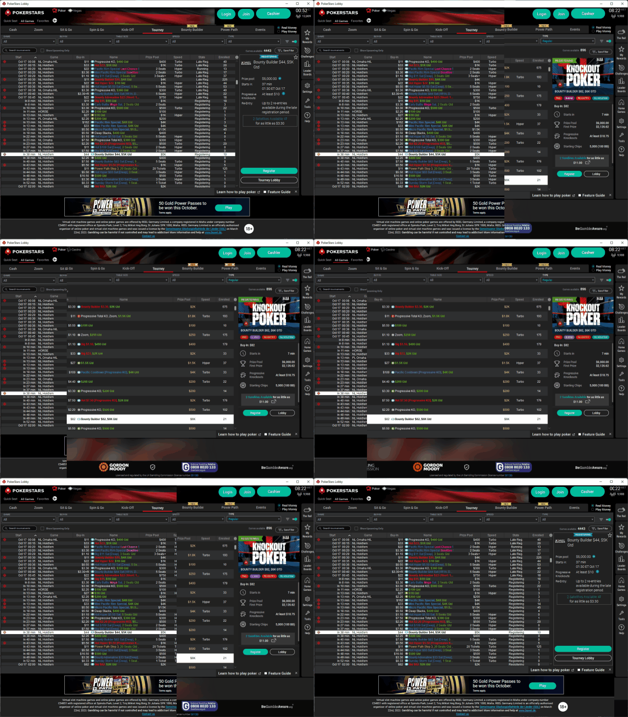
The most noticeable change in this update is the all-new tournament list view within the “Tourney” lobby. The “Start” and “State” columns have been merged, making it easier to identify tournaments in the “Late Reg” state, as they will now appear in striking red.
Moreover, tournaments that offer late registration now display a countdown indicating the remaining minutes until registration closes. This is a welcome improvement for players who want to keep a close eye on tournaments they can still join.
In the UK, changes to the lobby are more prominent. PokerStars has increased the row height of tournament listings, enhancing visual clarity and making it easier on the eyes. However, this adjustment does come with a trade-off as it now allows players to view only 14 to 15 tournaments per scroll, a decrease from the previous count of 40 or more.

A representative from PokerStars stated in its official Discord server that the increased row height feature is currently active in the UK market as part of a test phase, allowing the platform to gather valuable player feedback before considering a broader rollout to other regions.
Streamlined Tournament Data Presentation
Among other improvements are a range of enhancements aimed at making tournament data more accessible and organized. Notably, tournaments in which a player is registered now have their entire names displayed in italics, a marked improvement that offers a clear visual cue.
In addition, the “Prizepool” column is now highlighted in gold, ensuring it stands out and making it easier for players to spot the most lucrative tournaments.
PokerStars has also introduced a new “side car” feature, further streamlining the tournament viewing experience. This enhancement incorporates new icons and tags, providing players with an additional layer of clarity when navigating the tournament lobby.
PokerStars has taken aesthetics a step further with tournament branding. The inclusion of tournament-specific branding elements adds a touch of flair to the lobby, making it an even more visually appealing place for players.
For instance, bounty tournaments now display “Knockout Poker” branding on the side menu, along with the name of the specific game variant, such as “No Limit Hold’em, Pot Limit Omaha, 6+ Hold’em, HORSE.”
This informative branding also includes essential details like tournament start times, prize pools, starting chip counts, the number of big blinds (BBs), available satellites, and their pricing — all conveniently displayed without requiring players to access each tournament’s individual lobby.
Optimized Settings Interface
Beyond the tournament lobby enhancements, PokerStars has also optimized the settings interface for players. The addition of a new search option simplifies the process of locating specific settings.
Several settings have undergone refinement and merging to create a cleaner and more intuitive layout. For example, stack values in big blinds for observed games have been consolidated into the big blind display for cash games and tournaments, offering a more straightforward user interface.
Other improvements include support for Carbon Lite and Carbon table themes in the Spin & Go Flash variant, as well as enhancements to Home Games. Additionally, bug fixes have addressed issues related to notes and chat tabs, ensuring a smoother overall experience for all players.


