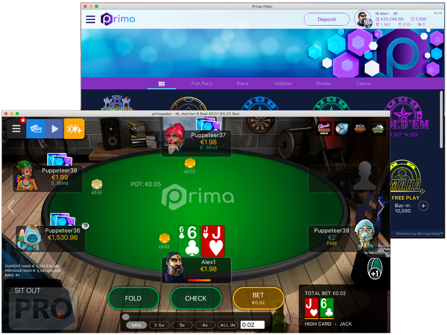

- An in-depth comparative of MPN’s new poker product Prima vs the classic client.
- A single codebase written in modern web technologies powers all desktop, mobile and web apps.
- The first customers will soft-launch the new client this Thursday.
When I first spoke to Alex Scott, Head of Product (Network Games) at Microgaming, about their upcoming online poker software Prima, he did not mince his words when describing the current state of MPN’s poker product.
“No part of our software is really competitive with what’s out there on the market at the moment,” he said. Later on, during a “before” demonstration to underscore just how much is set to change, he called the current platform “an old-fashioned experience,” overly burdened with complexity, swamped by over a decade of settings, additions and fixes.
“There are so many things about this client that bother me!” he said at one point.
The hour long demo certainly did its job of showing the night-and-day contrast with the new platform, which the company has dubbed Prima. It is immediately clear what MPN is trying to achieve: Gone are all the settings and options, the flood of table lists and myriad of tabs and filters. In its place is a slick, straightforward, attractive offer.
While my preview last week was hands off—the media, along with players, will get their first live experience when it rolls out to the first MPN skins this Thursday—it left quite an impression. It aims not just to bring MPN’s software to parity with the competition, it has its sights set on exceeding it.


